One of the things that drove many of us mad with
Microsoft Access was the way (by default!) that all data was editable. It still is in their many examples. But it's dangerous! A user could accidentally change something without realising it and all kinds of havoc could ensue. So the late Russell Westwood promoted the idea of
view mode (flat) and
change mode (sunken).
This is
view mode. Nothing can be changed here. This is a good visual cue that the user will understand. They will have to click the "Change" button to modify the data.
Here is
change mode. Notice how some fields are sunken so they can be edited, and other fields are still flat, so you can't change them for whatever reason. Notice, also, that in addition to the small cursor in the "Path" field which can be difficult to spot on a busy screen, the entire "Path" field is in focus and is therefore shown with a light yellow background. (Thanks to Chris Meares for that improvement.) Easy to spot, and still easy for the user to read the field contents.

Simple, elegant and almost obvious. Except that not everyone does it. So let's see how we can do this in
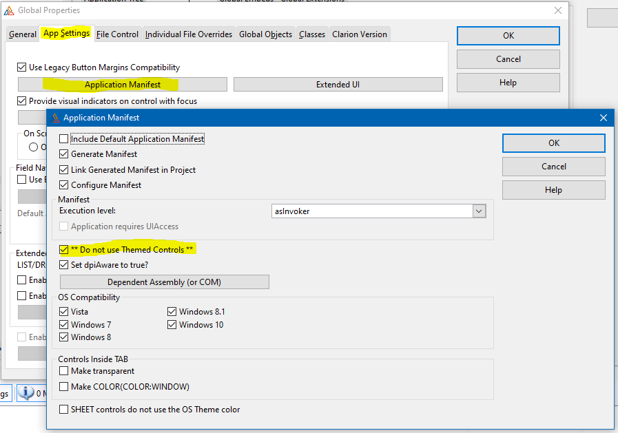
Clarion. Firstly, in the "Global Properties" tab, click on the "Actions" button.
Go to the "App Settings" tab and click on the "Application Manifest" button. The settings shown here are the ones I am experimenting with. In particular, the one labelled "** Do not use Themed Controls **". That prevents
Windows from flattening all my buttons and fields. Highly annoying, even if they think it is "cool" or something. Creating the manifest and using the "asInvoker" execution level will also avoid the
Windows User Account Control dialog box from appearing every time you try to run the program. Less annoying and more secure. Click "OK" to save these changes.
Check the "Provide visual indicators on control with focus" checkbox, and click on the "Set visual indicators" button. You can disable the "Box indicator" and "Visual indicator" because the box indicator is horrible and the visual indicator is hardly visible at all.
So let's look at the options for the "Control Color Indicator". The default yellow background is too bright, so I toned it down to the lightest yellow on the "Basic Colors" tab. And I switched off the bold option because it looks silly. For the "Required Fields" option I chose a very light sky blue. You have to remember to set the field control on the form to required, but it is worth it, particularly for the primary key fields and description fields that follow the primary key.
Here is a form I am working on. Because the GUID is generated by default, I have flattened and disabled the field altogether. The description field is required, which is why it is in light blue. I think it is dangerous to highlight the entire field like that, but I will put up with it.
Notice the "sight line" that I have drawn on the screenshot in orange. It lines up the left edges of the fields, and makes the form look neat. But the labels to the left of the sight line are (by default) left justified to the edge of the form, so they start to lose their "connection" with the fields they are supposed to label. Let's fix that.
Select all the labels, and change their justification to "RIGHT". Make them the same width and adjust if necessary if the width is too small. Click on the "Align Rights" button to line them up. Move the group of labels to the right until the window designer indicates you are the correct distance from the fields. Much neater, easier to read, and will work better on different screens because of the right alignment of the labels. Close the window designer.
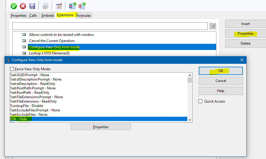
Go to the extensions tab for the form, and find the extension called "Configure View Only form mode". (If it's not there, you can insert it. It's called "ViewFormActions".) Click on "Properties" to see all the relevant controls listed. In this case, we are going to hide the "OK" button, to make it clear that you can't save any changes. Click on "?OK" and choose "properties".
Choose "Hide" from the drop-down list and click "OK". For reasons known only to this extension, the prompt control "set:ExcludeFiles" hasn't been made read only, so please change it to "Read Only", and then click "OK".
Go to the "Embeds" tab for the form and search for "view only" until you find the section in the "Init" procedure in the "Window Manager". Click on the "Filled Source" button to open the Embeditor at the right place.
Here we copy the generated part (highlighted) and paste it into the open section to change it. Comment out any references to check boxes, and then replace all "{PROP:ReadOnly}" parts to "{PROP:Flat}" in the open section. Remove any duplicate lines. Check boxes cannot be made flat, which is why we comment those references out.
So we have this in
view mode
and the same form in
change mode. Personally, I think the improved layout and additional visual cues are worth the effort.
Remember: good layout is invisible, it just draws you in to the important parts of the screen. Bad layout is immediately obvious, and confusing.


No comments:
Post a Comment